When I first got into an in-car UX project, I felt it would be all about making sleek-looking screens. I mean, I’d been doing UI/UX for a while, and a car dashboard? Just another screen, right?
But the moment I sat in the driver’s seat during a real test drive, it hit me but this isn’t just about screens. It’s about how drivers split their focus, make decisions under pressure, deal with physical limitations, and manage stress while on the move.
So I got three big lessons turning points that changed the way I approach designing for cars. These shifted me from being just a “screen designer” to thinking like a “driving experience designer.”
Turning Point 1: It’s Not About “User Interaction” but It’s About “Driver Decision Making”
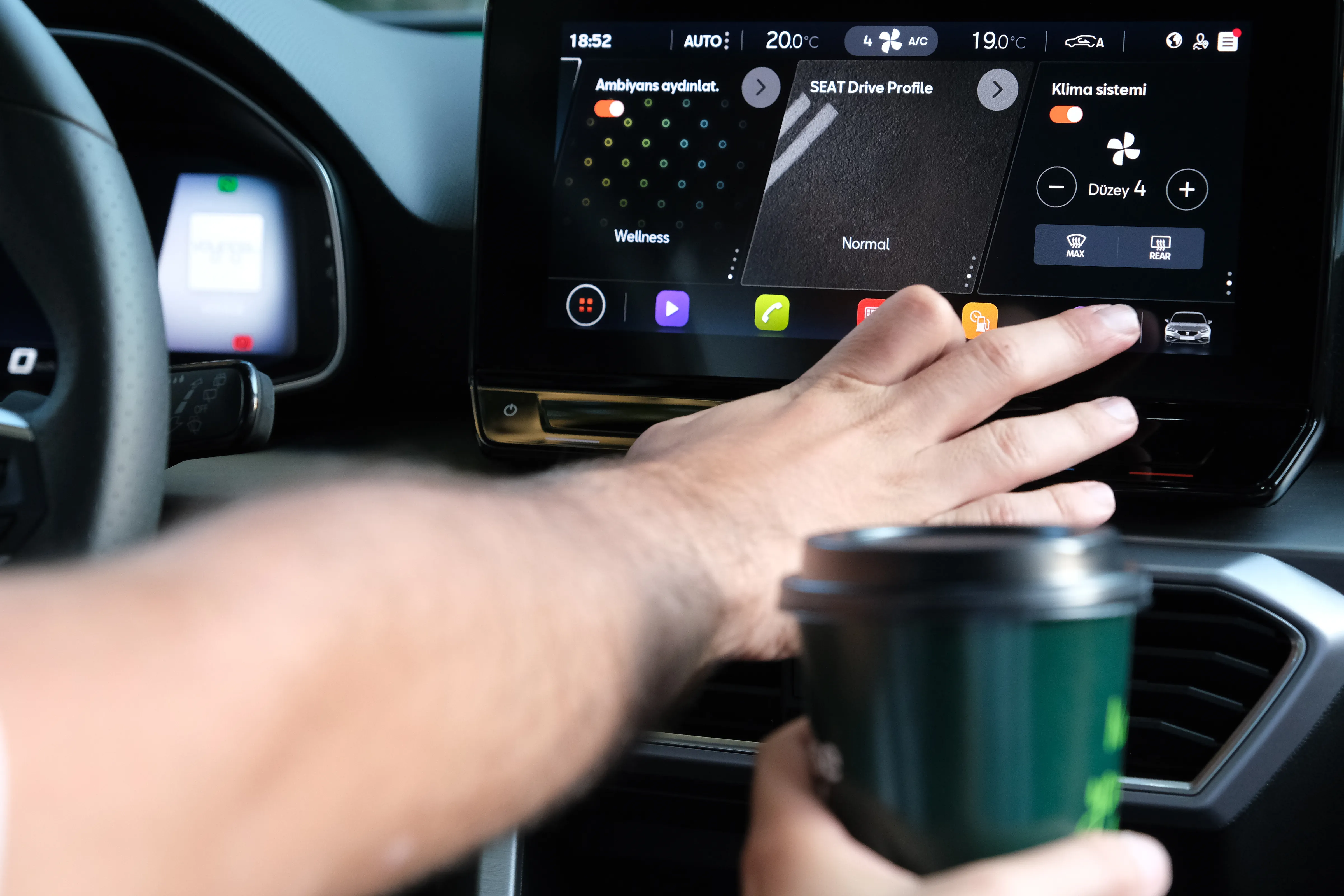
Our first UI version had everything like full control, lots of customization, and multi-layer menus. On paper, it looked solid.
But during real-world testing, drivers struggled. They weren’t calmly poking around while parked. They were zipping through traffic, reacting fast, and had zero patience for a complicated interface.
We had to strip it down, bring key actions to the surface, and simplify everything into one layer. We even added logic to hide or simplify features when the car was in motion.
Generality, drivers aren’t scrolling and browsing. They’re making fast decisions in a moving vehicle. So we have to designing quick, intuitive environments — not flows.
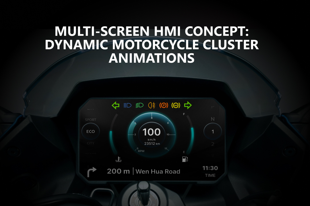
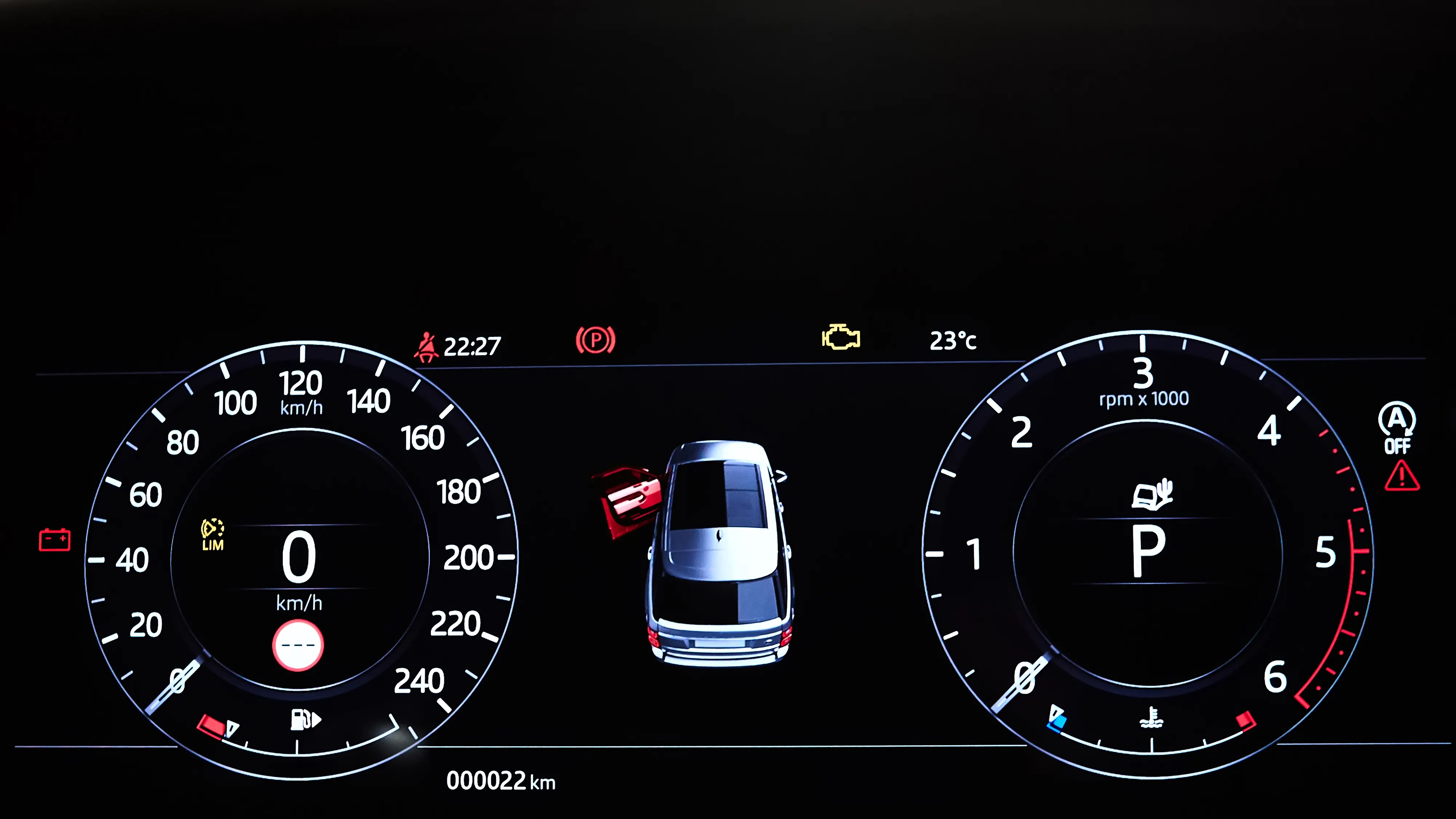
Turning Point 2: Visual Hierarchy Isn’t Just Design , It’s an Alert System
We had a gorgeous design before. Something like soft colors, consistent icons, and clean spacing. It looked amazing.
But our test drivers kept saying, “Yeah, it’s nice… but I can’t tell what’s important.”
In a car, you’ve got maybe 1–2 seconds to spot and understand what’s on the screen. So we started rethinking how we used contrast, motion, icon placement, and even sound or haptic feedback to help things stand out.
In-car visuals are not just about looking good — they need to guide attention instantly. Think emergency cues, not just pretty UI.
Turning Point 3: From Touchscreen Thinking to Context-Aware Design
Firstly, we thought of building the UI like a phone app: swipes, tabs, deep menus.
But in reality? Drivers don’t have the time or the free hands to deal with that. Their eyes and hands are already busy.
So we need to know how we can cut out manual interaction altogether? Can the car predict what the driver needs?
We added smart voice controls triggered by driving context, simple pop-up cards on the main screen, and personalized presets for different drivers. Suddenly, the system felt like it was one step ahead in a good way.
A good car UI should feel like a co-pilot. Contextual, quiet, and helpful even without demanding your attention.
Final Thoughts: We Design for Driving, Not for Dribbble
These moments taught me that in-car UX isn’t about making beautiful screens but creating a clear, calm, and reliable space while people drive.
Nobody’s admiring your font choices in a traffic jam. They just want to feel in control and not distracted. The best designs often go unnoticed, and that’s the point.
I think the future of automotive UX will be less about adding features and more about knowing when to stay out of the way. We’re not just designing interfaces. We’re shaping moments in motion.

Have a story or insight from your own in-car UX experience? Drop it in the comments. Stay tuned!